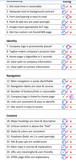
In general, DELL's website didn't have big prolems. But some small problems are also exist. Like, the size of words are small especially for old people. Logo is a little small and not showy that could be ignore sometimes. Home-page is a little full that need more time to find the information I want. Nevigation is not that good the contact information is at the lowest place of the homepage and the words are really small. The logo of Dell is the home-page link in other pages but in the home page it is only a pattern. I think even in the home-page, add a link in it is a good idea for customers to know that is a link there.
To make words larger and logo larger, delete some picutres in the home-page and put some information in the viewy place instead of puting them in the corner. Add a link in the logo in the home-page. The website will be better I think.
No comments:
Post a Comment